This project was all about graphic design. The process of redesigning the album cover sore me researching the artists history, music and most importantly the album I chose to redesign. I had to develop an understanding of the album and the underlying messages to create a meaningful and appropriate representation of my ideal version of the cover.

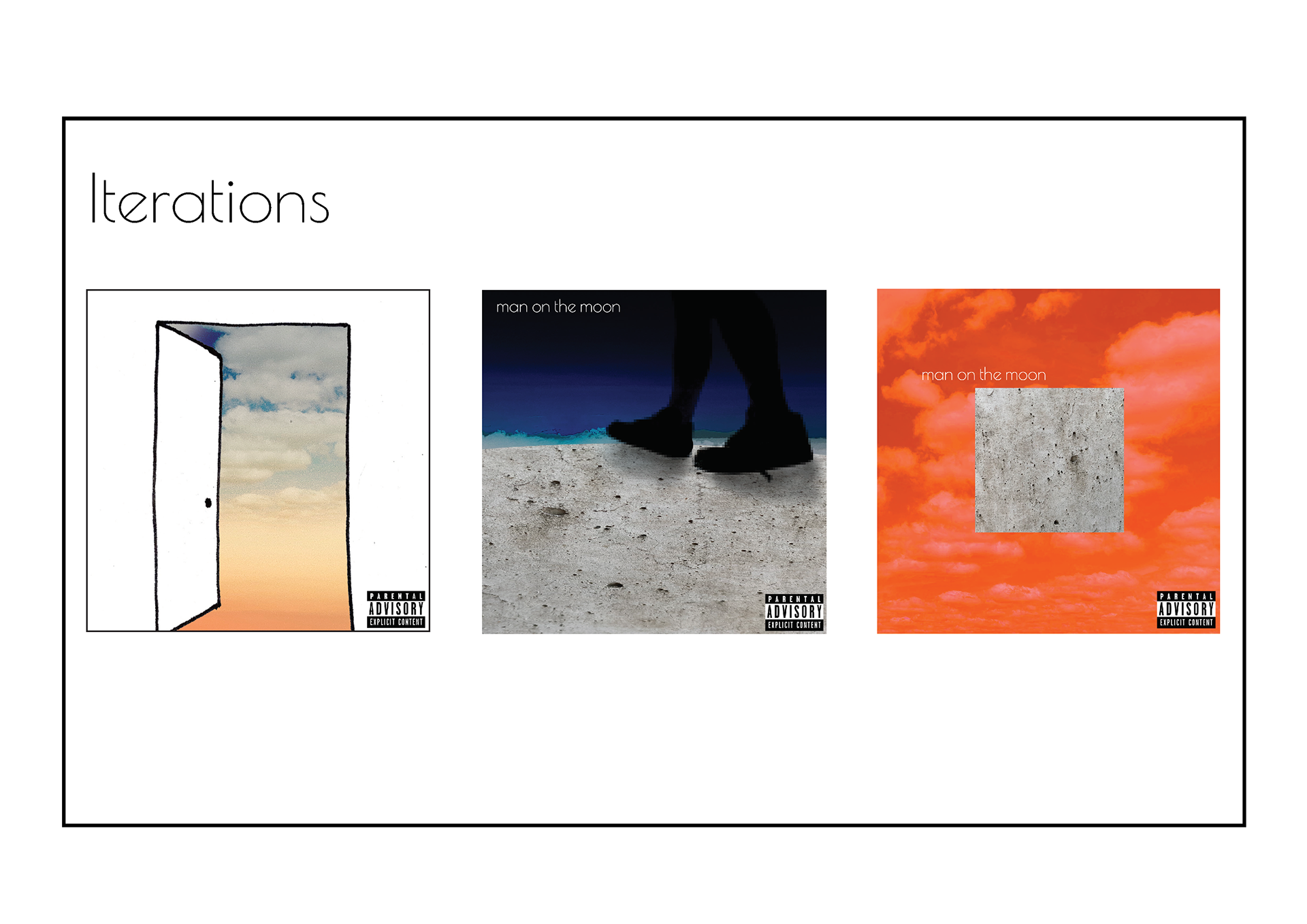

Cover 1
This was the first iteration that I explored. I wanted this concept to be quite simple yet striking. I used images from the back veranda of my house then added more layers of clouds to add depth of the image. For the doorway I experimented with real images of door's but I don't think that they were powerful enough and the design needed something else to catch the eye. I ended up using a sketch of a door with a simplified touch to the design. I'm not sure if it properly matched the theme of the album.
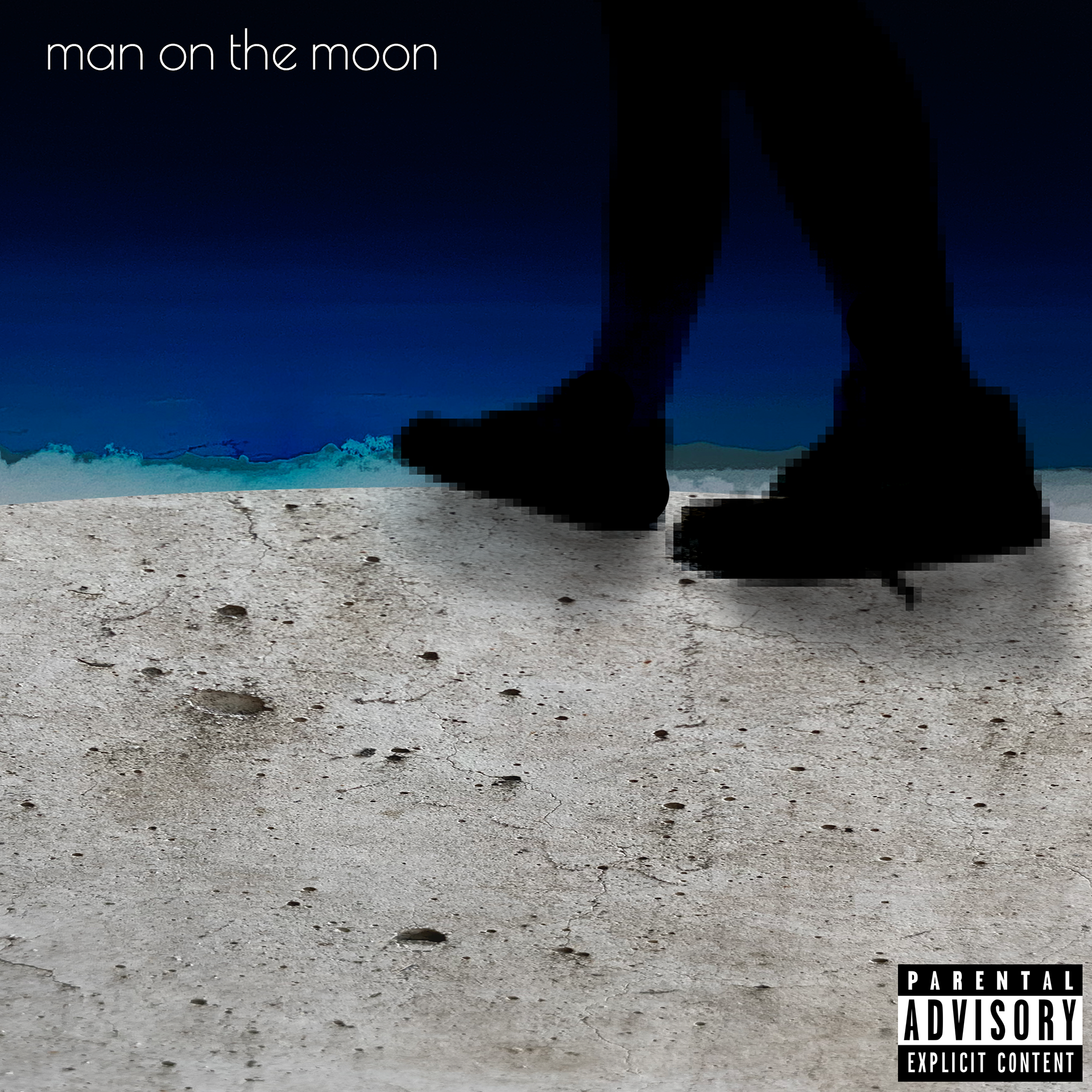
Cover 2
This was my second attempt at redesigning my favourite Kid Cudi Album and I honestly loved this concept. The whole point of this concept was to explore the most literal version of the album cover that I could think of. I believe it was really powerful, I used an image of myself sporting my favourite Nike's and then added filters to make it a silhouette then more filters to pixilate it for a more abstract less identifiable look. I used the texture of concrete from a wall for the moons surface. For the sky I used another picture of the sky from my self but adjusted the Hue and Saturation before inverting the colours to get the dramatic Blue we see in the image. I really liked this concept and it was very nearly the concept I chose to work with for the final product.
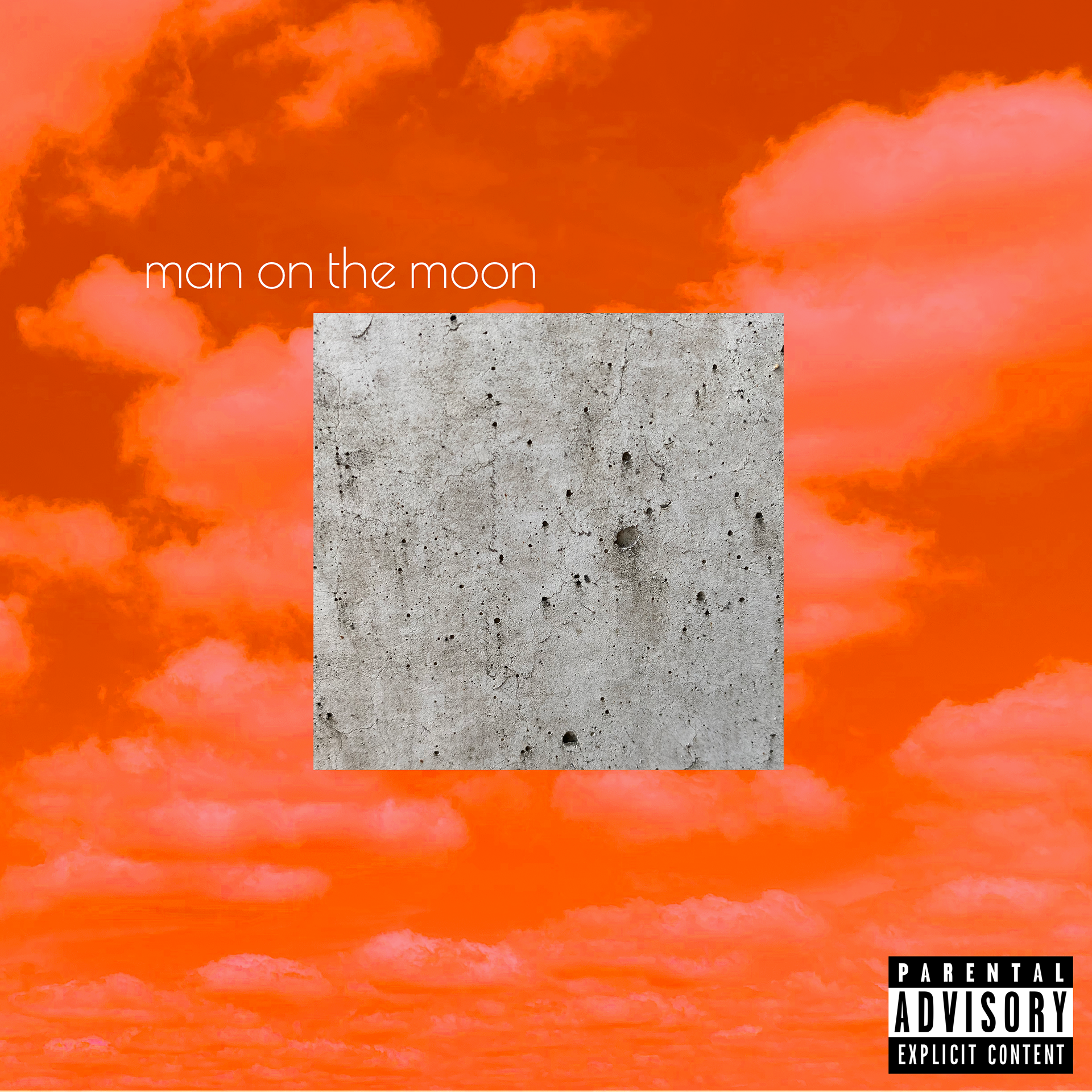
Cover 3
This was my final version of the album cover and I wanted to be really out there while maintaining a simplistic yet deeply meaningful piece. I used there aspects of the other concepts that I really liked such as the colour filters of the sky, the additional clouds and finally the very start cement texture to represent the moon. I knew that once I did this concept I wanted to continue with it because I thought it had a lot of potential and I liked how it tied to message and themes of the album.

Front of the Final Cover
There was a lot of development from the third iteration to this final product but overall I am very happy with this piece. Through adding some extra aspects such as the liquify and the colour filtered cement pieces I think it really lifted the overall aesthetic.

Back of the Final Cover
For the back of the album cover I wanted to introduce some basic block colours that matched front cover and gave me a chance to keep the design grounded and not over complicated.

Promotional Poster
For the poster I didn’t want to stray far from the design of the album cover. I wanted it to be a good teaser of the album.

Front & Back